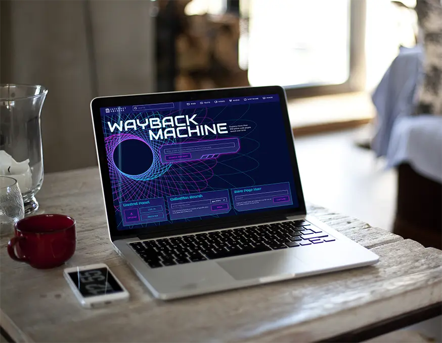
Wayback Machine
The well-known digital archive has been reimagined. Its modern yet nostalgic appearance emphasizes the experience of digital time travel.
Aim of project
Updating an outdated design while retaining the core features and elements. Since an archive is a kind of time travel for me, I aimed for a futuristic approach. This way, the user can truly feel like they are looking back at the past from the future.
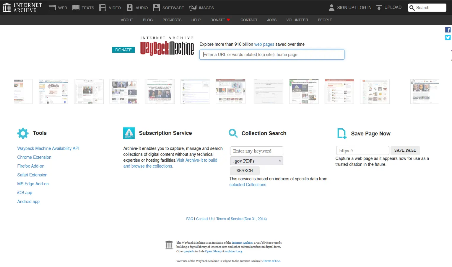
Frustrations
Lack of visual hiearchy
- the search field gets lost on the page
- all information seems equivalent due to the similar appearance
Typographical errors
- the used fonts do not follow a uniform system
- there is no proper distinction between headlines and descriptions
Layout problems
- disproportionate whitespace
- content blocks do not guide the user's attention well
Outdated visual appearance
- old-fashioned color scheme
- lack of visual elements that meet modern aesthetic expectations
- design reminiscent of the early 2000s is disappointing
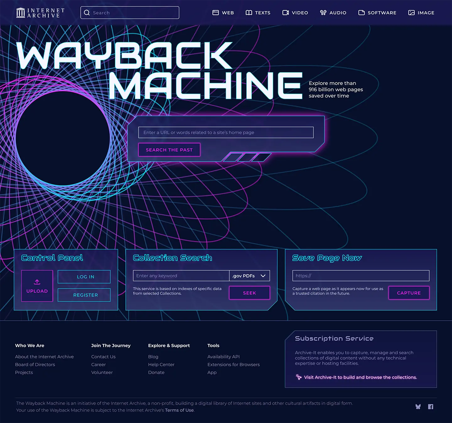
Solutions
Strengthening visual hierarchy
- better separation of the search field
- division of information in terms of user importance
Typograhy refinement
- highlight titles with a characteristic font
- creating consistent typography and clarifying the emphasis of information
Rhythm in layout
- reducing the feeling of crowding with spaces
- creating easily understandable blocks based on content
Modern UI
- contrasting color palette, vivid visual focus
- updated visual elements (shapes, effects, etc.)
- increasing confidence with a modern look